Form Elements
Description
Applying style to form elements such as labels, input fields and buttons. We also provide three types of layouts for forms. Right aligned label is the default layout. Left align label and top aligned label are alternate form layout.
The general concept is that each form consists of fields div class="field" and each field consists of a label style class="label" and an input style class="input" or output style class="output". Why all these extra style classes? Well, any HTML elements with these style classes will be automatically formatted according to CWO standards. You don't have to worry about the styles at all. And if the UI style changes, you won't have to change every single HTML element. Here's the idea:
<form>
    <div class="field">
        <div class="label">[your label here]</div>
        <div class="input">[your input elements here]</div>
    </div>
</form>
Sample
Form Layout
Default form layout with a pair of label and input field. Noticed the use of itag_required.
<form>
    <div class="field">
        <div class="label required">
            <label for="lastName">Last Name</label>
        </div>
        <div class="input">
            <input id="lastName" name="lastName"/>
        </div>
    </div>
</form>
Left aligned form layout with a pair of label and input field. Notice the class field_left in the div class="field"
<form>
    <div class="field_left">
        <div class="label required">
            <label for="lastName">Last Name</label>
        </div>
        <div class="input">
            <input id="lastName" name="lastName"/>
        </div>
    </div>
</form>
Top aligned form layout with a pair of label and input field. Notice the class top.
<form>
    <div class="field_top">
        <div class="label required">
            <label for="lastName">Last Name</label>
        </div>
        <div class="input">
            <input id="lastName" name="lastName"/>
        </div>
    </div>
</form>
Button
Allow user to perform a simple, finite action. There are two types of buttons. A primary button and a secondary button.
<input type="submit" value="Primary Button" class="button primary" />
<input type="submit" value="Secondary Button" class="button secondary" />
You can also make a link button.
<a href="#" class="button secondary" />
Disabled Button
For disabled buttons, it will be automatically rendered with lighter text and default cursor.
Button Alignment
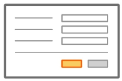
One Column:
Two Column:
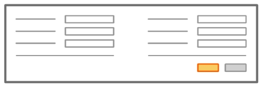
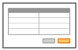
Table:
Form Field Error Message
Error message associated to a particular field in a form should display a detailed message at the field level and a general message at the top level.
Before
After
The label can switched to the red color by applying the class invalid to your label element:
<label for="comment" class="invalid">Comment</label>
The input field can switched to a red colored border by applying the class invalid to your input element:
<input type="text" name="lastName" id="lastName" class="invalid" />
The icon and the actual error message can be displayed using the class icon invalid and inline_invalid as shown in the following sample code:
<span class="icon invalid"> </span>
<span class="inline_invalid">Comment cannot be empty.</span>
Form submit with feedback
Always provide feed back to the users on long processing forms. For processes where progress cannot be measured, simply add class loading to a div or a span element.
<span class="loading"></span>